Customize your widget's colors and style
With Widget V2 you can style your badge and carousel widgets to match your website. There are two ways to do it: visual controls in the dashboard with no code, or CSS for developers who want full control.
Customize in the dashboard (no code)
Section titled “Customize in the dashboard (no code)”-
Open Website widgets, switch to the Your widgets tab, and click the gear icon next to a V2 widget.
-
On Step 1, pick a light or dark base and choose which elements to show (logo, button, verification).
-
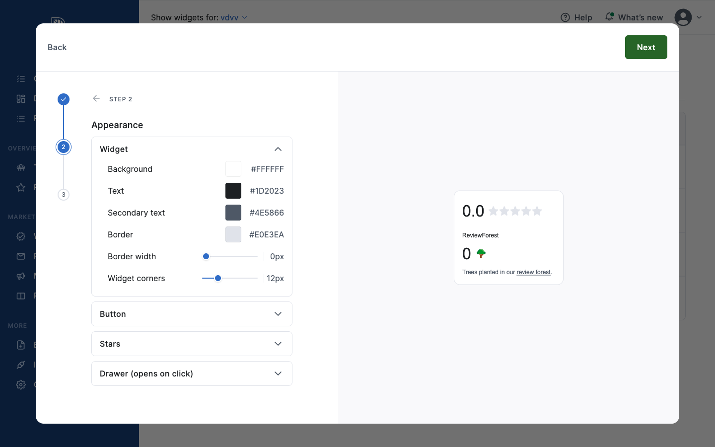
Go to Step 2: Appearance. This is where you set the colors and shape.
Widget: Background, Text, Secondary text, Border, Border width, and Widget corners (corner roundness).
Button: Background, Background on hover, Text, Border, Border width, and Button corners.
Stars: Active star and Inactive star colors.
Drawer (opens on click): colors and width for the panel that opens when a visitor clicks the badge, including the scrollbar, dividers, muted text, links, and tooltips.
-
Watch the live preview on the right update as you change values, then save. Your website picks up the new look automatically.
Customize with CSS (for developers)
Section titled “Customize with CSS (for developers)”V2 widgets expose a set of CSS custom properties (CSS variables) as a public styling API. Set them on the widget’s container element on your website:
<div class="reviewforest-app-xxxxxxxx"></div>
<style>  .reviewforest-app-xxxxxxxx {    --rf-bg: #ffffff;    --rf-text: #1a1a1a;    --rf-primary: #2f8f4e;        /* button background */    --rf-primary-text: #ffffff;   /* text on the button */    --rf-radius: 8px;    --rf-font: "Inter", sans-serif;  }</style>
Replace xxxxxxxx with your widget’s ID (it’s part of the class in the snippet you copied from the dashboard). You only need to set the properties you want to change — everything else keeps its default.
Colors, text and shape (all widgets)
Section titled “Colors, text and shape (all widgets)”| Variable | Controls |
|---|---|
--rf-primary | Button / call-to-action background |
--rf-primary-text | Text on the button |
--rf-primary-hover | Button background on hover |
--rf-bg | Background color |
--rf-text | Main text color |
--rf-text-secondary | Secondary text color |
--rf-text-muted | Muted / meta text color |
--rf-border | Border color |
--rf-border-subtle | Divider / hairline color |
--rf-radius | Corner roundness (container) |
--rf-radius-button | Corner roundness (buttons) |
--rf-font | Font family |
--rf-font-size | Base font size |
--rf-focus | Focus-ring color (keyboard navigation) |
--rf-link | Link color |
--rf-link-hover | Link color on hover |
--rf-star-filled | Filled star color |
--rf-star-empty | Empty star color |
--rf-warning-bg | Warning banner background |
--rf-warning-text | Warning banner text |
Badge widgets only
Section titled “Badge widgets only”| Variable | Controls |
|---|---|
--rf-shadow | Badge drop-shadow |
--rf-border-width | Badge border thickness |
--rf-badge-padding | Badge inner padding |
--rf-badge-gap | Gap between badge areas |
--rf-badge-hover | Badge hover background |
Review drawer (opens on click)
Section titled “Review drawer (opens on click)”| Variable | Controls |
|---|---|
--rf-drawer-width | Drawer panel width |
--rf-drawer-gap | Spacing between drawer sections |
--rf-drawer-shadow | Drawer drop-shadow |
--rf-drawer-scrollbar | Scrollbar color |
--rf-tooltip-bg | Tooltip background |
--rf-tooltip-text | Tooltip text color |
Testimonial carousel only
Section titled “Testimonial carousel only”| Variable | Controls |
|---|---|
--rf-slide-width | Card slide width |
--rf-slide-gap | Gap between slides |
--rf-dot-active | Active pagination dot color |
--rf-dot-inactive | Inactive pagination dot color |
--rf-dot-scale | Active dot scale factor |
--rf-dots-width | Pagination dots container width |
--rf-button-border | Navigation button border color |
--rf-button-border-width | Navigation button border width |
Why your styles stay put
Section titled “Why your styles stay put”V2 widgets render inside an isolated container (a Shadow DOM). That means your customizations apply cleanly to the widget, and the widget never accidentally changes the look of the rest of your website.